Components
Accordion
An expandable accordion component with smooth animations and customizable theming for Expo React Native. Learn how to use Accordion with examples and API documentation.
Installation
npx expo-app-ui add accordion:::note The accordion component is self-contained and doesn't require any external dependencies. :::
Usage
import Accordion from "@/components/ui/Accordion";

<Accordion
  data={[
    { id: '1', title: 'Item 1', content: 'Content here' }
  ]}
/>
Complete Example
Here's a complete example showing all accordion features:
import Accordion from "@/components/ui/Accordion";
import React from "react";
import { ScrollView, StyleSheet, Text } from "react-native";
export default function AccordionExampleScreen() {
const data = [
{
id: "1",
title: "What is React Native?",
content:
"React Native allows you to build mobile apps using JavaScript and React.",
},
{
id: "2",
title: "Is React Native fast?",
content:
"Yes. It uses native components and can be optimized when needed.",
},
{
id: "3",
title: "Can I use native code?",
content:
"Absolutely. Native modules can be written in Swift, Kotlin, or Java.",
},
];
return (
<ScrollView style={styles.container}>
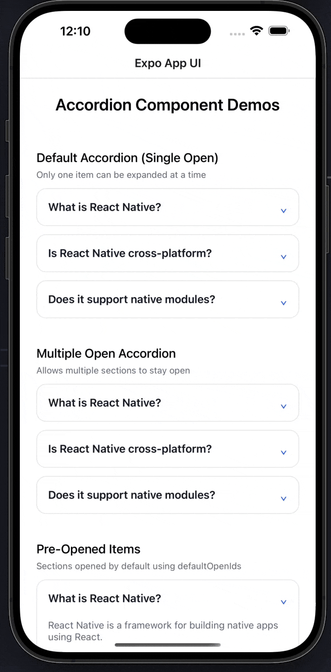
<Text style={styles.heading}>Accordion Component Demos</Text>
<Text style={styles.subHeading}>Default (Single Open)</Text>
<Accordion data={data} />
<Text style={styles.subHeading}>Multiple Open</Text>
<Accordion data={data} allowMultiple />
<Text style={styles.subHeading}>Pre-opened + Themed</Text>
<Accordion
data={data}
allowMultiple
defaultOpenIds={["1"]}
theme={{
accentColor: "#7fb239",
borderColor: "#7fb23950",
backgroundColor: "#F9FAFB",
}}
/>
</ScrollView>
);
}
const styles = StyleSheet.create({
container: {
flex: 1,
padding: 24,
backgroundColor: "#FFFFFF",
},
heading: {
fontSize: 24,
fontWeight: "600",
textAlign: "center",
marginBottom: 24,
},
subHeading: {
fontSize: 18,
fontWeight: "500",
marginTop: 28,
marginBottom: 12,
},
});Props
| Prop | Type | Default | Description |
|---|---|---|---|
data | AccordionItem[] | Required | Array of accordion items with id, title, and content |
allowMultiple | boolean | false | Allow multiple items to be open simultaneously |
defaultOpenIds | string[] | [] | Array of item IDs to be open by default |
theme | AccordionTheme | {} | Custom theme object for styling |
AccordionItem Type
interface AccordionItem {
  id: string;
  title: string;
  content: React.ReactNode;
}
AccordionTheme Type
interface AccordionTheme {
  backgroundColor?: string;
  borderColor?: string;
  textColor?: string;
  mutedTextColor?: string;
  accentColor?: string;
  borderRadius?: number;
}
Examples
Basic Accordion
<Accordion
  data={[
    {
      id: '1',
      title: 'What is React Native?',
      content: 'React Native allows you to build mobile apps using JavaScript and React.'
    }
  ]}
/>
Multiple Items Open
<Accordion
  data={data}
  allowMultiple
/>
Pre-opened Items
<Accordion
  data={data}
  defaultOpenIds={["1", "3"]}
/>
Custom Theme
<Accordion
  data={data}
  theme={{
    backgroundColor: "#F9FAFB",
    borderColor: "#7fb23950",
    textColor: "#111827",
    mutedTextColor: "#6B7280",
    accentColor: "#7fb239",
    borderRadius: 12,
  }}
/>
Combined Features
<Accordion
  data={data}
  allowMultiple
  defaultOpenIds={["1"]}
  theme={{
    accentColor: "#2563EB",
    borderColor: "#E5E7EB",
    backgroundColor: "#FFFFFF",
  }}
/>
Features
- Smooth Animations: Uses LayoutAnimation for smooth expand/collapse transitions
- Single or Multiple Open: Control whether multiple items can be open at once
- Customizable Theming: Full control over colors, borders, and styling
- Pre-opened Items: Set default open items on mount
- Animated Chevron: Rotating chevron indicator shows open/closed state
- Accessibility: Proper accessibility roles and states
- No Dependencies: Self-contained component with no external dependencies
- TypeScript Support: Full TypeScript types included
Notes
- The component uses
LayoutAnimationwhich requires enabling on Android (handled automatically) - Content can be any React node, not just text
- The chevron rotates 180 degrees when an item is opened
- When
allowMultipleis false, opening one item closes others - Theme values are merged with defaults, so you only need to specify what you want to override
- The component handles all state management internally
Custom Modal
An animated modal component with backdrop, bottom sheet support, and smooth animations for Expo React Native. Learn how to use CustomModal with examples and API documentation.
Calendar
A flexible calendar component supporting single date selection, date ranges, and customizable theming for Expo React Native. Learn how to use Calendar with examples and API documentation.