Progress Bar
A customizable progress bar component with variants, labels, and count support for Expo React Native. Learn how to use ProgressBar with examples and API documentation.
Installation
npx expo-app-ui add progress-bar:::note The progress bar component is self-contained and doesn't require any external dependencies. :::
Usage
import CustomProgressBar from "@/components/ui/progress-bar";

<CustomProgressBar progress={50} />
Complete Example
Here's a complete example showing all progress bar features:
import CustomText from "@/components/ui/custom-text";
import CustomProgressBar from "@/components/ui/progress-bar";
import React, { useState } from "react";
import { StyleSheet, TouchableOpacity, View } from "react-native";
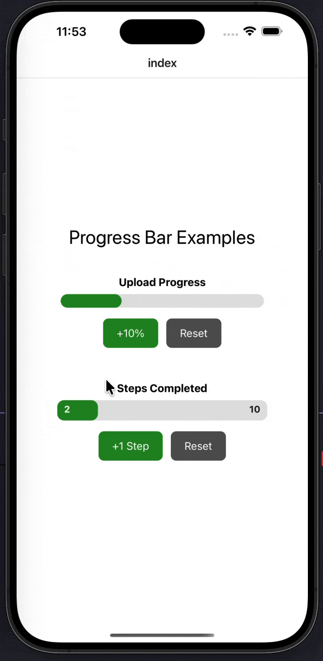
export default function Index() {
const [progress, setProgress] = useState(30);
const [currentCount, setCurrentCount] = useState(2);
const totalCount = 10;
const increaseProgress = () => {
setProgress((prev) => Math.min(prev + 10, 100));
};
const resetProgress = () => {
setProgress(0);
};
const increaseCount = () => {
setCurrentCount((prev) => Math.min(prev + 1, totalCount));
};
const resetCount = () => {
setCurrentCount(0);
};
return (
<View style={styles.container}>
<CustomText fontSize={28} style={styles.title}>
Progress Bar Examples
</CustomText>
{/* Normal Progress */}
<View style={styles.section}>
<CustomProgressBar label="Upload Progress" progress={progress} />
<View style={styles.buttonRow}>
<TouchableOpacity style={styles.button} onPress={increaseProgress}>
<CustomText color="white">+10%</CustomText>
</TouchableOpacity>
<TouchableOpacity
style={[styles.button, styles.resetButton]}
onPress={resetProgress}
>
<CustomText color="white">Reset</CustomText>
</TouchableOpacity>
</View>
</View>
{/* Count Variant */}
<View style={styles.section}>
<CustomProgressBar
label="Steps Completed"
variant="count"
count={totalCount}
currentCount={currentCount}
/>
<View style={styles.buttonRow}>
<TouchableOpacity style={styles.button} onPress={increaseCount}>
<CustomText color="white">+1 Step</CustomText>
</TouchableOpacity>
<TouchableOpacity
style={[styles.button, styles.resetButton]}
onPress={resetCount}
>
<CustomText color="white">Reset</CustomText>
</TouchableOpacity>
</View>
</View>
</View>
);
}
const styles = StyleSheet.create({
container: {
flex: 1,
justifyContent: "center",
paddingHorizontal: 24,
backgroundColor: "#FFFFFF",
},
title: {
textAlign: "center",
marginBottom: 40,
},
section: {
marginBottom: 50,
alignItems: "center",
},
buttonRow: {
flexDirection: "row",
marginTop: 16,
gap: 12,
},
button: {
backgroundColor: "#228B22",
paddingVertical: 12,
paddingHorizontal: 20,
borderRadius: 8,
},
resetButton: {
backgroundColor: "#555",
},
});Props
| Prop | Type | Default | Description |
|---|---|---|---|
progress | number | - | Progress percentage (0-100). Required for normal variant |
width | number | 300 | Progress bar width |
height | number | 20 | Progress bar height |
color | string | "#228B22" | Progress bar fill color |
backgroundColor | string | "#e0e0e0" | Progress bar background color |
label | string | "" | Optional label text above the progress bar |
variant | 'normal' | 'count' | 'normal' | Progress bar variant |
count | number | 1 | Total count (required for count variant) |
currentCount | number | 0 | Current count (required for count variant) |
Examples
Basic Progress Bar
<CustomProgressBar progress={50} />With Label
<CustomProgressBar
  label="Upload Progress"
  progress={75}
/>
Custom Size
<CustomProgressBar
  progress={60}
  width={400}
  height={30}
/>
Custom Colors
<CustomProgressBar
  progress={80}
  color="#2563EB"
  backgroundColor="#E5E7EB"
/>
Count Variant
The count variant displays progress as a fraction (e.g., "2/10"):
<CustomProgressBar
  variant="count"
  count={10}
  currentCount={7}
  label="Steps Completed"
/>
Animated Progress
The progress bar automatically animates when the progress value changes:
const [progress, setProgress] = useState(0);

useEffect(() => {
  const interval = setInterval(() => {
    setProgress((prev) => (prev >= 100 ? 0 : prev + 10));
  }, 500);
  return () => clearInterval(interval);
}, []);

<CustomProgressBar progress={progress} label="Loading..." />
Dynamic Count Progress
const [currentStep, setCurrentStep] = useState(0);
const totalSteps = 5;

<CustomProgressBar
  variant="count"
  count={totalSteps}
  currentCount={currentStep}
  label="Processing Steps"
/>
Features
- Two Variants: Normal (percentage) and count (fraction) variants
- Smooth Animations: Automatically animates when progress changes
- Customizable Styling: Control width, height, colors, and labels
- Count Display: Shows current/total count overlay for count variant
- Label Support: Optional label text above the progress bar
- No Dependencies: Self-contained component with no external dependencies
- Responsive: Works with any width/height combination
- Animated Transitions: Smooth progress updates with React Native Animated API
Notes
- Progress values are automatically clamped between 0 and 100
- The count variant calculates progress as
(currentCount / count) * 100 - The progress bar uses React Native's
AnimatedAPI for smooth transitions - Animation duration is 500ms by default
- The count variant displays numbers on the progress bar (current/total)
- For count variant, make sure
count > 0to avoid division by zero - All styling uses black and white defaults - no theme dependencies required
- The component uses native
ViewandTextcomponents (no custom dependencies)
Profile Pic
A profile picture component with fallback, loading state, and customizable styling for Expo React Native. Learn how to use ProfilePic with examples and API documentation.
Loading Bar & Top Loading Bar Context
A top loading bar component with React Context for managing loading state across your Expo React Native application. Complete setup guide with examples.