Loading Bar & Top Loading Bar Context
A top loading bar component with React Context for managing loading state across your Expo React Native application. Complete setup guide with examples.
Installation
npx expo-app-ui add top-loading-bar:::note
This command will automatically add both the loading-bar component and top-loading-bar-context context to your project, as they work together.
:::
Step-by-Step Setup
Step 1: Wrap Your App with LoadingProvider
Update your root _layout.tsx file to wrap your app with the LoadingProvider:
import { LoadingProvider } from "@/context/top-loading-bar-context";
import { Stack } from "expo-router";

export default function RootLayout() {
  return (
    <LoadingProvider>
      <Stack />
    </LoadingProvider>
  );
}
Optional: You can customize the loading bar color:
<LoadingProvider color="#007AFF">
  <Stack />
</LoadingProvider>
Step 2: Use the Hook in Your Components
Now you can use the useTopLoadingBar hook in any component within your app:
import { useTopLoadingBar } from "@/context/top-loading-bar-context";

const { showLoading, hideLoading } = useTopLoadingBar();

// Show loading bar
showLoading();

// Hide loading bar
hideLoading();
Complete Example
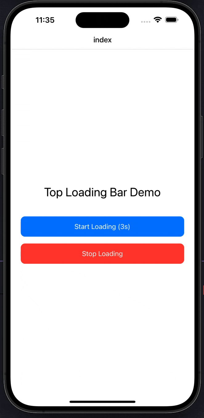
Here's a complete example showing how to use the top loading bar in a screen:
import CustomText from "@/components/ui/custom-text";
import { useTopLoadingBar } from "@/context/top-loading-bar-context";
import React from "react";
import { StyleSheet, TouchableOpacity, View } from "react-native";

export default function Index() {
  const { showLoading, hideLoading } = useTopLoadingBar();

  const handleStartLoading = () => {
    showLoading();
    // Simulate API call
    setTimeout(() => {
      hideLoading();
    }, 3000);
  };

  return (
    <View style={styles.container}>
      <CustomText fontSize={28} style={styles.title}>
        Top Loading Bar Demo
      </CustomText>

      <TouchableOpacity style={styles.button} onPress={handleStartLoading}>
        <CustomText color="white" fontSize={16}>
          Start Loading (3s)
        </CustomText>
      </TouchableOpacity>

      <TouchableOpacity
        style={[styles.button, styles.stopButton]}
        onPress={hideLoading}
      >
        <CustomText color="white" fontSize={16}>
          Stop Loading
        </CustomText>
      </TouchableOpacity>
    </View>
  );
}

const styles = StyleSheet.create({
  container: {
    flex: 1,
    justifyContent: "center",
    paddingHorizontal: 24,
    backgroundColor: "#FFFFFF",
  },
  title: {
    textAlign: "center",
    marginBottom: 40,
  },
  button: {
    backgroundColor: "#007AFF",
    paddingVertical: 14,
    borderRadius: 10,
    alignItems: "center",
    marginBottom: 16,
  },
  stopButton: {
    backgroundColor: "#FF3B30",
  },
});
Setup in _layout.tsx
Make sure to wrap your app with LoadingProvider in your root layout file:
import { LoadingProvider } from "@/context/top-loading-bar-context";
import { Stack } from "expo-router";

export default function RootLayout() {
  return (
    <LoadingProvider>
      <Stack />
    </LoadingProvider>
  );
}
Component API
LoadingBar Component
The LoadingBar component is automatically rendered by the LoadingProvider. You typically don't need to use it directly.
| Prop | Type | Default | Description |
|---|---|---|---|
color | string | "#007AFF" | Loading bar color |
LoadingProvider
| Prop | Type | Default | Description |
|---|---|---|---|
color | string | "#007AFF" | Loading bar color |
children | React.ReactNode | Required | App content (usually your navigation stack) |
Hook API
useTopLoadingBar
Returns an object with the following methods:
| Method | Type | Description |
|---|---|---|
showLoading() | () => void | Shows the loading bar at the top of the screen |
hideLoading() | () => void | Hides the loading bar |
Examples
Basic Usage
import { useTopLoadingBar } from "@/context/top-loading-bar-context";

function MyComponent() {
  const { showLoading, hideLoading } = useTopLoadingBar();

  const handleApiCall = async () => {
    showLoading();
    try {
      await fetchData();
    } finally {
      hideLoading();
    }
  };

  return <Button onPress={handleApiCall} title="Load Data" />;
}
With Custom Color
// In _layout.tsx
<LoadingProvider color="#16A34A">
  <Stack />
</LoadingProvider>
Multiple Loading States
function MyComponent() {
  const { showLoading, hideLoading } = useTopLoadingBar();

  const handleMultipleActions = async () => {
    showLoading();

    await action1();
    await action2();
    await action3();

    hideLoading();
  };

  return <Button onPress={handleMultipleActions} title="Process" />;
}
With Error Handling
const handleApiCall = async () => {
  showLoading();
  try {
    const response = await fetch('/api/data');
    if (!response.ok) throw new Error('Failed');
    // Handle success
  } catch (error) {
    // Handle error
  } finally {
    hideLoading();
  }
};
Features
- Global State Management: Access loading state from any component
- Easy-to-Use Hook API: Simple
showLoading()andhideLoading()methods - Customizable Color: Set your preferred loading bar color
- Automatic Integration: Loading bar component is automatically included
- Smooth Animations: Built with React Native Reanimated for 60fps animations
- Top Position: Always appears at the top of the screen with high z-index
- No Dependencies: Self-contained context and component
- Infinite Loop Animation: Continuous smooth scrolling animation
Notes
- The
LoadingProvidermust wrap your entire app (usually in_layout.tsx) - The loading bar appears at the top of the screen with
position: absoluteandzIndex: 9999 - The loading bar automatically animates in and out
- You can call
showLoading()andhideLoading()from any component within the provider - The default color is
#007AFF(iOS blue), but you can customize it - The loading bar uses React Native Reanimated for smooth animations
- Make sure to call
hideLoading()after your async operations complete (usefinallyblock for reliability) - Both
loading-barcomponent andtop-loading-bar-contextare required - they work together as a complete solution
Progress Bar
A customizable progress bar component with variants, labels, and count support for Expo React Native. Learn how to use ProgressBar with examples and API documentation.
Marquee
A smooth scrolling marquee component (also known as scroll text animation) for displaying continuous text or content in Expo React Native. Learn how to use Marquee with examples and API documentation.