OTP Input
A customizable OTP (One-Time Password) input component with validation states, loading, success, and error states for Expo React Native. Learn how to use OTPInput with examples and API documentation.
Installation
npx expo-app-ui add otp-input:::note The OTP input component is self-contained and doesn't require any external dependencies. :::
Usage
import CustomOtpInput from "@/components/ui/otp-input";

<CustomOtpInput
  length={6}
  onChangeText={setOtp}
  onSubmit={(otp) => verifyOTP(otp)}
/>
Complete Example
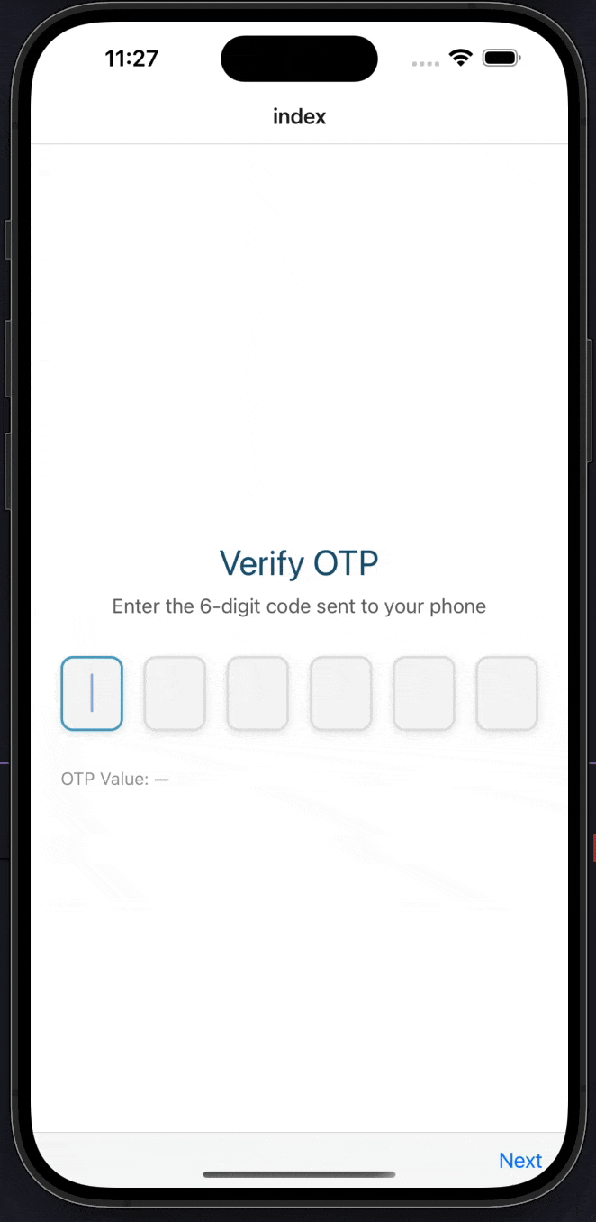
Here's a complete example showing how to use the OTP input component with validation states:
import CustomText from "@/components/ui/custom-text";
import CustomOtpInput from "@/components/ui/otp-input";
import React, { useState } from "react";
import { Alert, StyleSheet, View } from "react-native";

export default function Index() {
  const [otp, setOtp] = useState("");
  const [isLoading, setIsLoading] = useState(false);
  const [isSuccess, setIsSuccess] = useState(false);
  const [isError, setIsError] = useState(false);

  const handleOtpChange = (value: string) => {
    setOtp(value);
    setIsError(false);
    setIsSuccess(false);
  };

  const handleSubmit = async (value: string) => {
    setIsLoading(true);

    // Simulate API verification
    setTimeout(() => {
      setIsLoading(false);

      if (value === "123456") {
        setIsSuccess(true);
        Alert.alert("Success", "OTP Verified Successfully!");
      } else {
        setIsError(true);
        Alert.alert("Error", "Invalid OTP");
      }
    }, 1500);
  };

  return (
    <View style={styles.container}>
      <CustomText fontSize={28} color="#175676" style={styles.title}>
        Verify OTP
      </CustomText>

      <CustomText fontSize={16} color="#666" style={styles.subtitle}>
        Enter the 6-digit code sent to your phone
      </CustomText>

      <CustomOtpInput
        length={6}
        value={otp}
        onChangeText={handleOtpChange}
        onSubmit={handleSubmit}
        isLoading={isLoading}
        isSuccess={isSuccess}
        isError={isError}
      />

      <CustomText fontSize={14} color="#999">
        OTP Value: {otp || "—"}
      </CustomText>
    </View>
  );
}

const styles = StyleSheet.create({
  container: {
    flex: 1,
    justifyContent: "center",
    paddingHorizontal: 24,
    backgroundColor: "#FFFFFF",
  },
  title: {
    textAlign: "center",
    marginBottom: 8,
  },
  subtitle: {
    textAlign: "center",
    marginBottom: 30,
  },
});
Props
| Prop | Type | Default | Description |
|---|---|---|---|
length | number | 6 | Number of OTP digits |
onChangeText | (otp: string) => void | Required | Callback when OTP changes |
onSubmit | (otp: string) => void | - | Callback when OTP is complete (all digits entered) |
autoFocus | boolean | true | Auto focus first input on mount |
isLoading | boolean | false | Show loading state (reduces opacity) |
isDisabled | boolean | false | Disable all inputs |
isSuccess | boolean | false | Show success state (green border) |
isError | boolean | false | Show error state (red border, auto-clears after 3s) |
value | string | - | Controlled value for OTP |
inputStyle | object | - | Custom styles for input fields |
containerStyle | object | - | Custom styles for container |
focusColor | string | "#4BA3C3" | Border color when input is focused |
blurColor | string | "#E0E0E0" | Border color when input is not focused |
Examples
Basic OTP Input
import CustomOtpInput from "@/components/ui/otp-input";
import { useState } from "react";

const [otp, setOtp] = useState("");

<CustomOtpInput
  length={6}
  onChangeText={setOtp}
  onSubmit={(otp) => console.log('OTP:', otp)}
/>
With Validation States
<CustomOtpInput
  length={6}
  onChangeText={handleOtpChange}
  onSubmit={handleSubmit}
  isLoading={isVerifying}
  isSuccess={isVerified}
  isError={hasError}
/>
Custom Length
{/* 4-digit OTP */}
<CustomOtpInput length={4} onChangeText={setOtp} />

{/* 8-digit OTP */}
<CustomOtpInput length={8} onChangeText={setOtp} />
Controlled Value
<CustomOtpInput
  length={6}
  value={otp}
  onChangeText={setOtp}
  onSubmit={handleSubmit}
/>
Custom Styling
<CustomOtpInput
  length={6}
  onChangeText={setOtp}
  inputStyle={{
    width: 60,
    height: 70,
    fontSize: 28,
  }}
  focusColor="#2563EB"
  blurColor="#D1D5DB"
/>
Features
- Individual Input Fields: Each digit has its own input field
- Automatic Focus Management: Auto-focuses next input when digit is entered
- Smart Backspace Handling: Moves to previous input on backspace
- Validation States: Support for loading, success, and error states
- Auto-Submit: Automatically calls
onSubmitwhen all digits are entered - Controlled/Uncontrolled: Supports both controlled (
valueprop) and uncontrolled modes - Keyboard Optimization: Uses
number-padkeyboard type - Auto-Complete Support: Supports iOS/Android OTP auto-fill
- Visual Feedback: Color changes for focus, success, error, and loading states
- No Dependencies: Self-contained component with no external dependencies
Notes
- The component automatically dismisses the keyboard when all digits are entered
- Error state automatically clears after 3 seconds
- Success state persists until manually cleared
- Loading state reduces opacity and disables inputs
- The component supports iOS and Android OTP auto-fill via
autoComplete="one-time-code" - Backspace automatically moves focus to the previous input if current input is empty
- All inputs are automatically selected when focused for easy replacement
Birthdate Picker
A native-style date picker component for selecting birthdates with month, day, and year wheels for Expo React Native. Learn how to use CustomBirthdatePicker with examples and API documentation.
Profile Pic
A profile picture component with fallback, loading state, and customizable styling for Expo React Native. Learn how to use ProfilePic with examples and API documentation.