Components
Button
A flexible button component with variants and icon support for Expo React Native. Learn how to use Button with examples and API documentation.
Installation
npx expo-app-ui add button:::note The button component is self-contained and doesn't require any external dependencies. :::
Usage
import Button from "@/components/ui/button";
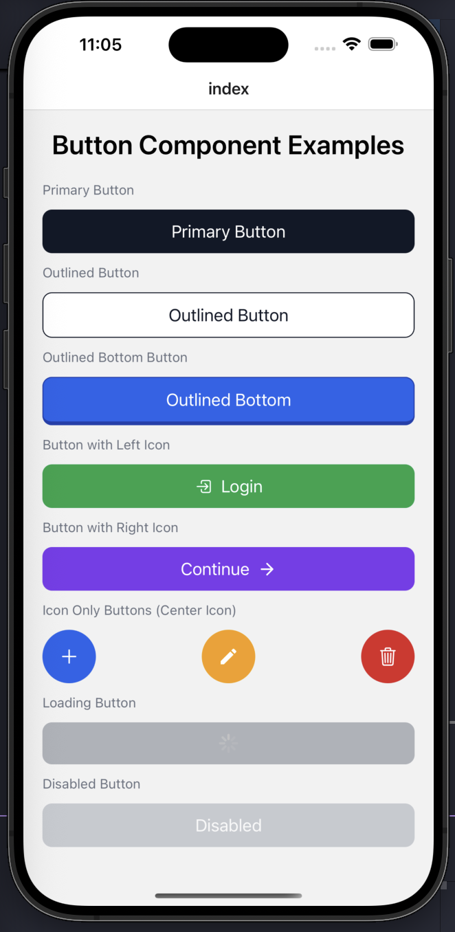
<Button title="Click Me" onPress={() => console.log('Pressed')} />Complete Example
Here's a comprehensive example showing all button variants and features:
import React from "react";
import { View, StyleSheet, ScrollView } from "react-native";
import Button from "@/components/ui/button";
import CustomText from "@/components/ui/custom-text";
import {
  Ionicons,
  Feather,
  MaterialIcons,
} from "@expo/vector-icons";

export default function ButtonExamples() {
  return (
    <ScrollView
      contentContainerStyle={styles.container}
      showsVerticalScrollIndicator={false}
    >
      <CustomText fontSize={28} style={styles.heading}>
        Button Component Examples
      </CustomText>

      {/* PRIMARY */}
      <CustomText style={styles.label}>Primary Button</CustomText>
      <Button
        title="Primary Button"
        bgColor="#111827"
        onPress={() => {}}
      />

      {/* OUTLINED */}
      <CustomText style={styles.label}>Outlined Button</CustomText>
      <Button
        title="Outlined Button"
        variant="outlined"
        textColor="#111827"
        borderColor="#111827"
        onPress={() => {}}
      />

      {/* OUTLINED BOTTOM */}
      <CustomText style={styles.label}>Outlined Bottom Button</CustomText>
      <Button
        title="Outlined Bottom"
        variant="outlinedBottom"
        bgColor="#2563EB"
        borderColor="#1E40AF"
        textColor="#fff"
        onPress={() => {}}
      />

      {/* LEFT ICON */}
      <CustomText style={styles.label}>Button with Left Icon</CustomText>
      <Button
        title="Login"
        bgColor="#16A34A"
        IconLeft={() => (
          <Ionicons name="log-in-outline" size={20} color="#fff" />
        )}
        onPress={() => {}}
      />

      {/* RIGHT ICON */}
      <CustomText style={styles.label}>Button with Right Icon</CustomText>
      <Button
        title="Continue"
        bgColor="#7C3AED"
        IconRight={() => (
          <Feather name="arrow-right" size={20} color="#fff" />
        )}
        onPress={() => {}}
      />

      {/* CENTER ICON ONLY */}
      <CustomText style={styles.label}>Icon Only Buttons (Center Icon)</CustomText>
      <View style={styles.iconRow}>
        <Button
          title="Add"
          bgColor="#2563EB"
          IconCenter={() => (
            <Ionicons name="add" size={24} color="#fff" />
          )}
          hideTextWithCenterIcon
          style={styles.iconButton}
          onPress={() => {}}
        />

        <Button
          title="Edit"
          bgColor="#F59E0B"
          IconCenter={() => (
            <MaterialIcons name="edit" size={22} color="#fff" />
          )}
          hideTextWithCenterIcon
          style={styles.iconButton}
          onPress={() => {}}
        />

        <Button
          title="Delete"
          bgColor="#DC2626"
          IconCenter={() => (
            <Ionicons name="trash-outline" size={22} color="#fff" />
          )}
          hideTextWithCenterIcon
          style={styles.iconButton}
          onPress={() => {}}
        />
      </View>

      {/* LOADING */}
      <CustomText style={styles.label}>Loading Button</CustomText>
      <Button
        title="Loading..."
        loading
        bgColor="#6B7280"
        onPress={() => {}}
      />

      {/* DISABLED */}
      <CustomText style={styles.label}>Disabled Button</CustomText>
      <Button
        title="Disabled"
        disabled
        bgColor="#9CA3AF"
        onPress={() => {}}
      />
    </ScrollView>
  );
}

const styles = StyleSheet.create({
  container: {
    padding: 20,
    gap: 12,
  },
  heading: {
    textAlign: "center",
    fontWeight: "600",
    marginBottom: 16,
  },
  label: {
    fontSize: 14,
    color: "#6B7280",
    marginTop: 12,
    marginBottom: 6,
  },
  iconRow: {
    flexDirection: "row",
    justifyContent: "space-between",
    gap: 12,
  },
  iconButton: {
    width: 56,
    height: 56,
    borderRadius: 28,
    paddingHorizontal: 0,
  },
});
Props
| Prop | Type | Default | Description |
|---|---|---|---|
title | string | Required | Button text |
variant | 'primary' | 'outlined' | 'outlinedBottom' | 'normal' | 'custom' | 'primary' | Button variant |
onPress | () => void | Required | Press handler |
disabled | boolean | false | Disabled state |
loading | boolean | false | Loading state (shows activity indicator) |
IconLeft | React.ComponentType | undefined | Left icon component |
IconRight | React.ComponentType | undefined | Right icon component |
IconCenter | React.ComponentType | undefined | Center icon component |
hideTextWithCenterIcon | boolean | false | Hide text when IconCenter is present |
fontSize | number | 18 | Custom font size |
fontWeight | string | 'normal' | Custom font weight |
textColor | string | '#fff' | Custom text color |
bgColor | string | 'black' | Custom background color |
borderColor | string | '#d3d3d3' | Custom border color |
style | StyleProp<ViewStyle> | - | Custom container styles |
textStyle | StyleProp<TextStyle> | - | Custom text styles |
Examples
Basic Button
<Button title="Click Me" onPress={() => console.log('Pressed')} />Variants
{/* Primary (default) */}
<Button title="Primary" bgColor="#111827" onPress={() => {}} />

{/* Outlined */}
<Button
  title="Outlined"
  variant="outlined"
  textColor="#111827"
  borderColor="#111827"
  onPress={() => {}}
/>

{/* Outlined Bottom */}
<Button
  title="Outlined Bottom"
  variant="outlinedBottom"
  bgColor="#2563EB"
  borderColor="#1E40AF"
  textColor="#fff"
  onPress={() => {}}
/>
With Icons
{/* Left Icon */}
<Button
  title="Login"
  bgColor="#16A34A"
  IconLeft={() => <Ionicons name="log-in-outline" size={20} color="#fff" />}
  onPress={() => {}}
/>

{/* Right Icon */}
<Button
  title="Continue"
  bgColor="#7C3AED"
  IconRight={() => <Feather name="arrow-right" size={20} color="#fff" />}
  onPress={() => {}}
/>

{/* Center Icon (Icon Only) */}
<Button
  title="Add"
  bgColor="#2563EB"
  IconCenter={() => <Ionicons name="add" size={24} color="#fff" />}
  hideTextWithCenterIcon
  style={{ width: 56, height: 56, borderRadius: 28 }}
  onPress={() => {}}
/>
Loading and Disabled States
{/* Loading */}
<Button
  title="Loading..."
  loading
  bgColor="#6B7280"
  onPress={() => {}}
/>

{/* Disabled */}
<Button
  title="Disabled"
  disabled
  bgColor="#9CA3AF"
  onPress={() => {}}
/>
Features
- Multiple Variants: Primary, outlined, outlined bottom, normal, and custom
- Icon Support: Left, right, and center icon positions
- Icon-Only Buttons: Use center icon with
hideTextWithCenterIconprop - Loading State: Shows activity indicator when
loadingis true - Disabled State: Automatically reduces opacity when disabled
- Fully Customizable: Control colors, sizes, fonts, and styles
- No Dependencies: Self-contained component with black/white defaults