Components
Custom Modal
An animated modal component with backdrop, bottom sheet support, and smooth animations for Expo React Native. Learn how to use CustomModal with examples and API documentation.
Installation
npx expo-app-ui add custom-modalBasic Usage
Centered Modal
import CustomModal from "@/components/ui/custom-modal";
import { useState } from "react";
import { View, Text } from "react-native";
export default function MyComponent() {
const [visible, setVisible] = useState(false);
return (
<>
<Button onPress={() => setVisible(true)} title="Open Modal" />
<CustomModal
visible={visible}
onClose={() => setVisible(false)}
>
<View style={{ padding: 20 }}>
<Text>Modal Content</Text>
<Button
title="Close"
onPress={() => setVisible(false)}
/>
</View>
</CustomModal>
</>
);
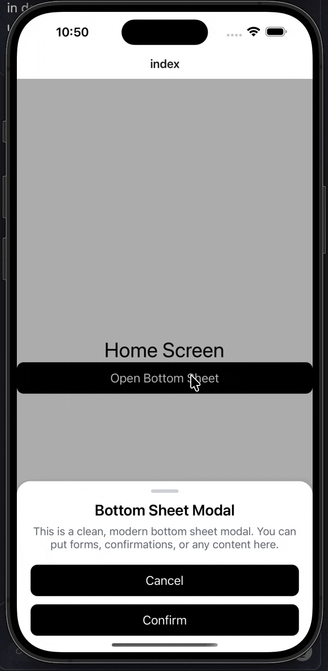
}Bottom Sheet Modal
Create a bottom sheet by setting justifyContent: "flex-end" in the style prop:
import CustomModal from "@/components/ui/custom-modal";
import CustomText from "@/components/ui/custom-text";
import Button from "@/components/ui/button";
import { useState } from "react";
import { StyleSheet, View } from "react-native";

export default function Index() {
  const [visible, setVisible] = useState(false);

  return (
    <View style={styles.container}>
      <CustomText fontSize={30} color="black">
        Home Screen
      </CustomText>

      <Button title="Open Bottom Sheet" onPress={() => setVisible(true)} />

      <CustomModal
        visible={visible}
        onClose={() => setVisible(false)}
        style={styles.bottomSheetContainer}
        modalStyle={styles.bottomSheet}
      >
        {/* Handle */}
        <View style={styles.handle} />

        <CustomText fontSize={22} style={styles.title}>
          Bottom Sheet Modal
        </CustomText>

        <CustomText style={styles.description}>
          This is a clean, modern bottom sheet modal. You can put forms,
          confirmations, or any content here.
        </CustomText>

        <View style={styles.actions}>
          <Button title="Cancel" onPress={() => setVisible(false)} />
          <Button title="Confirm" onPress={() => setVisible(false)} />
        </View>
      </CustomModal>
    </View>
  );
}

const styles = StyleSheet.create({
  container: {
    flex: 1,
    justifyContent: "center",
    alignItems: "center",
  },
  bottomSheetContainer: {
    justifyContent: "flex-end",
  },
  bottomSheet: {
    paddingHorizontal: 20,
    paddingBottom: 24,
    paddingTop: 12,
  },
  handle: {
    width: 40,
    height: 5,
    borderRadius: 3,
    backgroundColor: "#D1D5DB",
    alignSelf: "center",
    marginBottom: 12,
  },
  title: {
    fontWeight: "600",
    textAlign: "center",
    marginBottom: 8,
  },
  description: {
    textAlign: "center",
    color: "#6B7280",
    marginBottom: 20,
  },
  actions: {
    gap: 12,
  },
});
Customization Examples
Custom Colors
<CustomModal
  visible={visible}
  onClose={() => setVisible(false)}
  backgroundColor="#000000"
  backdropColor="rgba(0, 0, 0, 0.8)"
  borderRadius={20}
>
  <Text style={{ color: "#FFFFFF" }}>Dark Modal</Text>
</CustomModal>
No Backdrop
<CustomModal
  visible={visible}
  onClose={() => setVisible(false)}
  noBackdrop
  style={{ justifyContent: "flex-end" }}
>
  <Text>Modal without backdrop</Text>
</CustomModal>
Prevent Backdrop Touch from Closing
By default, tapping the backdrop closes the modal. To prevent this:
<CustomModal
  visible={visible}
  onClose={() => setVisible(false)}
  preventBackgroundTouchEvent={true}
>
  <Text>Modal that doesn't close on backdrop touch</Text>
</CustomModal>
Props
| Prop | Type | Default | Description |
|---|---|---|---|
visible | boolean | Required | Controls modal visibility |
onClose | () => void | Required | Callback when modal should close |
preventBackgroundTouchEvent | boolean | false | If true, prevents backdrop touch from closing modal. By default, backdrop touch closes the modal. |
children | React.ReactNode | Required | Modal content |
style | StyleProp<ViewStyle> | - | Style for root container. Set justifyContent: "flex-end" for bottom sheet. |
modalStyle | StyleProp<ViewStyle> | - | Style for modal content box |
noBackdrop | boolean | false | Hide backdrop completely |
backgroundColor | string | "#FFFFFF" | Modal background color |
backdropColor | string | "rgba(0, 0, 0, 0.5)" | Backdrop color |
borderRadius | number | 15 | Border radius for modal |
Features
- Smooth Animations: Built with React Native Reanimated for 60fps animations
- Bottom Sheet Support: Automatically detects bottom sheet style and adjusts behavior
- Keyboard Handling: Automatically moves bottom sheet up when keyboard appears
- Android Back Button: Handles Android hardware back button to close modal
- Customizable: Full control over colors, styling, and behavior
- Backdrop Touch: By default, tapping backdrop closes the modal (can be disabled)
- No Dependencies: Uses black and white defaults - no theme dependencies required
Notes
- The modal automatically detects bottom sheet style when
justifyContent: "flex-end"is set in thestyleprop - Bottom sheets automatically handle keyboard appearance and adjust position accordingly
- The modal uses React Native Reanimated for smooth animations
- All styling uses black and white defaults - no theme dependencies required