Profile Pic
A profile picture component with fallback, loading state, and customizable styling for Expo React Native. Learn how to use ProfilePic with examples and API documentation.
Installation
npx expo-app-ui add profile-pic:::note
The profile pic component is self-contained and doesn't require any external dependencies. It uses expo-image for optimized image loading.
:::
Usage
import ProfilePic from "@/components/ui/profile-pic";
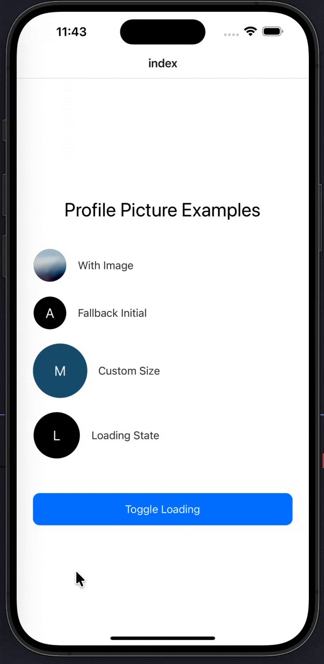
<ProfilePic source="https://example.com/avatar.jpg" username="John Doe" />Complete Example
Here's a complete example showing all profile pic features:
import CustomText from "@/components/ui/custom-text";
import ProfilePic from "@/components/ui/profile-pic";
import React, { useState } from "react";
import { StyleSheet, TouchableOpacity, View } from "react-native";

export default function Index() {
  const [loading, setLoading] = useState(false);
  const toggleLoading = () => {
    setLoading(true);
    setTimeout(() => setLoading(false), 10000);
  };

  return (
    <View style={styles.container}>
      <CustomText fontSize={28} style={styles.title}>
        Profile Picture Examples
      </CustomText>

      {/* Default avatar with image */}
      <View style={styles.row}>
        <ProfilePic source="john.png" username="John" />
        <CustomText style={styles.label}>With Image</CustomText>
      </View>

      {/* No image → fallback initial */}
      <View style={styles.row}>
        <ProfilePic username="Alice" backgroundColor="black" />
        <CustomText style={styles.label}>Fallback Initial</CustomText>
      </View>

      {/* Custom size & border */}
      <View style={styles.row}>
        <ProfilePic
          username="Michael"
          width={80}
          height={80}
          borderWidth={2}
          borderColor="#175676"
          backgroundColor="#175676"
        />
        <CustomText style={styles.label}>Custom Size</CustomText>
      </View>

      {/* Loading state */}
      <View style={styles.row}>
        <ProfilePic
          username="Loading"
          width={70}
          height={70}
          isLoading={loading}
        />
        <CustomText style={styles.label}>Loading State</CustomText>
      </View>

      {/* Toggle loading */}
      <TouchableOpacity style={styles.button} onPress={toggleLoading}>
        <CustomText color="white">Toggle Loading</CustomText>
      </TouchableOpacity>
    </View>
  );
}

const styles = StyleSheet.create({
  container: {
    flex: 1,
    justifyContent: "center",
    paddingHorizontal: 24,
    backgroundColor: "#FFFFFF",
  },
  title: {
    textAlign: "center",
    marginBottom: 40,
  },
  row: {
    flexDirection: "row",
    alignItems: "center",
    marginBottom: 20,
    gap: 16,
  },
  label: {
    fontSize: 16,
    color: "#333",
  },
  button: {
    marginTop: 30,
    backgroundColor: "#007AFF",
    paddingVertical: 14,
    borderRadius: 10,
    alignItems: "center",
  },
});
Props
| Prop | Type | Default | Description |
|---|---|---|---|
source | string | - | Image URL or path. If not provided, shows fallback initial |
username | string | Required | Username for fallback initials (first letter will be displayed) |
width | number | 50 | Image width |
height | number | 50 | Image height |
borderRadius | number | 50 | Border radius (50 = circle) |
borderWidth | number | 1 | Border width |
borderColor | string | "#FFFFFF" | Border color |
backgroundColor | string | "#000000" | Background color for fallback initial |
isLoading | boolean | false | Show loading indicator |
style | StyleProp<ViewStyle> | - | Custom container styles |
Examples
With Image
<ProfilePic source="https://example.com/avatar.jpg" username="John Doe" />Fallback to Initials
When no image is provided, the component automatically shows the first letter of the username:
<ProfilePic username="Jane Smith" />Custom Size
<ProfilePic
  username="Michael"
  width={80}
  height={80}
  borderRadius={40}
/>
Custom Border
<ProfilePic
  username="Alice"
  width={60}
  height={60}
  borderWidth={3}
  borderColor="#007AFF"
  backgroundColor="#007AFF"
/>
Loading State
<ProfilePic
  username="Loading"
  width={70}
  height={70}
  isLoading={true}
/>
Circle Avatar
{/* Default is circle (borderRadius: 50) */}
<ProfilePic username="John" width={50} height={50} />

{/* Square avatar */}
<ProfilePic username="John" width={50} height={50} borderRadius={10} />
With Environment Variable URL
The component supports EXPO_PUBLIC_API_URL for image paths:
{/* If EXPO_PUBLIC_API_URL is set, image will be loaded from: */}
{/* ${EXPO_PUBLIC_API_URL}/avatar/john.png */}
<ProfilePic source="john.png" username="John" />
Features
- Automatic Fallback: Shows user initial when image is not available
- Loading State: Built-in loading indicator
- Optimized Images: Uses
expo-imagefor better performance and blurhash support - Customizable: Full control over size, border, colors, and styling
- Blurhash Placeholder: Supports blurhash for smooth image loading
- No Dependencies: Self-contained component (only requires expo-image)
- Flexible Sizing: Support for any width/height combination
- Border Support: Customizable border width and color
Notes
- The component uses
expo-imagefor optimized image loading - If
sourceis not provided, the component automatically shows the first letter ofusername - The default
borderRadiusof 50 creates a perfect circle - Loading state shows an
ActivityIndicatorin the center - The component supports blurhash placeholders for smooth loading transitions
- Image paths can use
EXPO_PUBLIC_API_URLenvironment variable if set - The fallback initial is always white text on the specified background color
- All styling uses black and white defaults - no theme dependencies required
OTP Input
A customizable OTP (One-Time Password) input component with validation states, loading, success, and error states for Expo React Native. Learn how to use OTPInput with examples and API documentation.
Progress Bar
A customizable progress bar component with variants, labels, and count support for Expo React Native. Learn how to use ProgressBar with examples and API documentation.