Components
Auto Scroll Cards
A carousel component with auto-scrolling, manual swipe, and indicator support for Expo React Native. Learn how to use AutoScrollCards with examples and API documentation.
Installation
npx expo-app-ui add auto-scroll-cards:::note The auto-scroll cards component is self-contained and doesn't require any external dependencies. :::
Usage
import AutoScrollCards from "@/components/ui/AutoScrollCards";

<AutoScrollCards
  data={items}
  cardWidth={300}
  renderItem={(item) => <Card {...item} />}
/>
Complete Example
Here's a complete example showing all auto-scroll cards features:
import AutoScrollCards from "@/components/ui/AutoScrollCards";
import React from "react";
import { ScrollView, StyleSheet, Text, View } from "react-native";
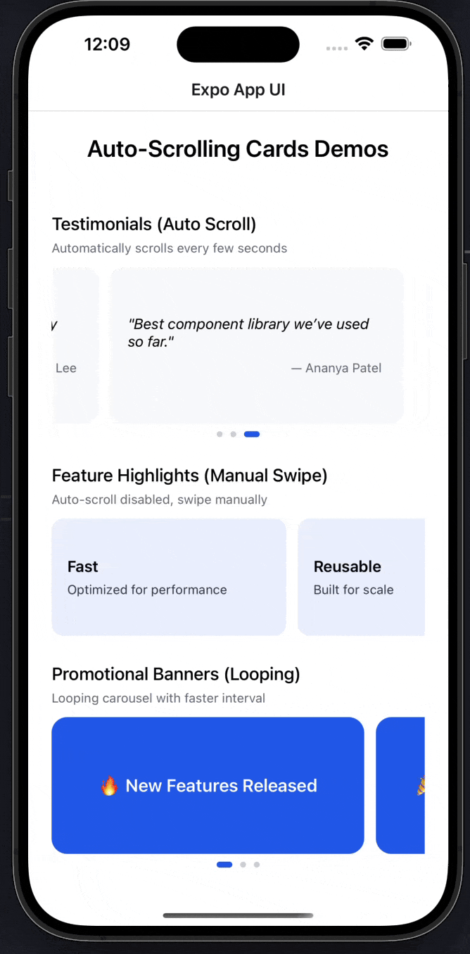
export default function AutoScrollCardsExampleScreen() {
const testimonials = [
{
quote: "This product completely changed our workflow.",
author: "Sarah Johnson",
},
{
quote: "Clean UI, smooth animations, very easy to use.",
author: "Michael Lee",
},
{
quote: "Best component library we've used so far.",
author: "Ananya Patel",
},
];
const features = [
{ title: "Fast", desc: "Optimized for performance" },
{ title: "Reusable", desc: "Built for scale" },
{ title: "Customizable", desc: "Theme it your way" },
];
const banners = [
{ label: "🔥 New Features Released" },
{ label: "🎉 50% Discount This Week" },
{ label: "🚀 Upgrade Your Experience" },
];
return (
<ScrollView style={styles.container}>
<Text style={styles.heading}>Auto-Scrolling Cards Demos</Text>
{/* ================= Testimonials ================= */}
<Text style={styles.subHeading}>Testimonials (Auto Scroll)</Text>
<Text style={styles.caption}>
Automatically scrolls every few seconds
</Text>
<AutoScrollCards
data={testimonials}
cardWidth={300}
interval={3500}
autoScroll
loop
renderItem={(item) => (
<View style={styles.testimonialCard}>
<Text style={styles.quote}>"{item.quote}"</Text>
<Text style={styles.author}>— {item.author}</Text>
</View>
)}
/>
{/* ================= Features ================= */}
<Text style={styles.subHeading}>Feature Highlights (Manual Swipe)</Text>
<Text style={styles.caption}>Auto-scroll disabled, swipe manually</Text>
<AutoScrollCards
data={features}
cardWidth={240}
autoScroll={false}
showIndicators={false}
renderItem={(item) => (
<View style={styles.featureCard}>
<Text style={styles.featureTitle}>{item.title}</Text>
<Text style={styles.featureDesc}>{item.desc}</Text>
</View>
)}
/>
{/* ================= Banners ================= */}
<Text style={styles.subHeading}>Promotional Banners (Looping)</Text>
<Text style={styles.caption}>Looping carousel with faster interval</Text>
<AutoScrollCards
data={banners}
cardWidth={320}
interval={2500}
loop
renderItem={(item) => (
<View style={styles.bannerCard}>
<Text style={styles.bannerText}>{item.label}</Text>
</View>
)}
/>
</ScrollView>
);
}
const styles = StyleSheet.create({
container: {
flex: 1,
padding: 24,
backgroundColor: "#FFFFFF",
},
heading: {
fontSize: 24,
fontWeight: "600",
textAlign: "center",
marginBottom: 24,
},
subHeading: {
fontSize: 18,
fontWeight: "500",
marginTop: 28,
marginBottom: 6,
},
caption: {
fontSize: 13,
color: "#6B7280",
marginBottom: 12,
},
/* -------- Cards -------- */
testimonialCard: {
backgroundColor: "#F9FAFB",
borderRadius: 14,
padding: 20,
height: 160,
justifyContent: "center",
},
quote: {
fontSize: 15,
fontStyle: "italic",
marginBottom: 10,
},
author: {
fontSize: 13,
color: "#6B7280",
textAlign: "right",
},
featureCard: {
backgroundColor: "#EEF2FF",
borderRadius: 12,
padding: 16,
height: 120,
justifyContent: "center",
},
featureTitle: {
fontSize: 16,
fontWeight: "600",
marginBottom: 6,
},
featureDesc: {
fontSize: 13,
color: "#374151",
},
bannerCard: {
backgroundColor: "#2563EB",
borderRadius: 16,
height: 140,
justifyContent: "center",
alignItems: "center",
},
bannerText: {
color: "#FFFFFF",
fontSize: 18,
fontWeight: "600",
},
});Props
| Prop | Type | Default | Description |
|---|---|---|---|
data | T[] | Required | Array of data items to display |
renderItem | (item: T, index: number) => ReactNode | Required | Function to render each card |
cardWidth | number | Required | Width of each card in pixels |
gap | number | 12 | Gap between cards in pixels |
autoScroll | boolean | true | Enable automatic scrolling |
interval | number | 3000 | Auto-scroll interval in milliseconds |
loop | boolean | true | Loop back to first card after last |
showIndicators | boolean | true | Show dot indicators at bottom |
Examples
Basic Auto-Scroll
<AutoScrollCards
  data={testimonials}
  cardWidth={300}
  renderItem={(item) => (
    <View style={styles.card}>
      <Text>{item.text}</Text>
    </View>
  )}
/>
Manual Swipe Only
<AutoScrollCards
  data={items}
  cardWidth={240}
  autoScroll={false}
  renderItem={(item) => <Card {...item} />}
/>
Custom Interval
<AutoScrollCards
  data={banners}
  cardWidth={320}
  interval={2500}
  loop
  renderItem={(item) => <Banner {...item} />}
/>
Without Indicators
<AutoScrollCards
  data={items}
  cardWidth={280}
  showIndicators={false}
  renderItem={(item) => <Card {...item} />}
/>
No Looping
<AutoScrollCards
  data={items}
  cardWidth={300}
  loop={false}
  renderItem={(item) => <Card {...item} />}
/>
Custom Gap
<AutoScrollCards
  data={items}
  cardWidth={280}
  gap={20}
  renderItem={(item) => <Card {...item} />}
/>
Features
- Automatic Scrolling: Configurable auto-scroll with custom intervals
- Manual Swipe Support: Users can swipe to navigate manually
- Smart Pause: Auto-scroll pauses when user interacts
- Looping Carousel: Seamlessly loops from last to first card
- Dot Indicators: Visual indicators showing current position
- Smooth Snap Scrolling: Cards snap to position with smooth animations
- Generic Type Support: Works with any data type via TypeScript generics
- No Dependencies: Self-contained component with no external dependencies
- Performance Optimized: Uses FlatList for efficient rendering
Notes
- Auto-scroll automatically pauses when the user starts swiping
- The component resumes auto-scrolling after user interaction ends
- When
loopis false, scrolling stops at the last card - Card width should match your design - the component handles spacing
- The gap prop controls spacing between cards
- Indicators show active state with a larger, colored dot
- Works best with 2+ items (auto-scroll disabled for single item)
- The component uses
FlatListunder the hood for optimal performance - All cards should have the same width for best visual consistency
Marquee
A smooth scrolling marquee component (also known as scroll text animation) for displaying continuous text or content in Expo React Native. Learn how to use Marquee with examples and API documentation.
Theme Constants
Theme constants including colors, fonts, and sizes for consistent styling in Expo React Native. Learn how to use the theme constants in your project.