
Components
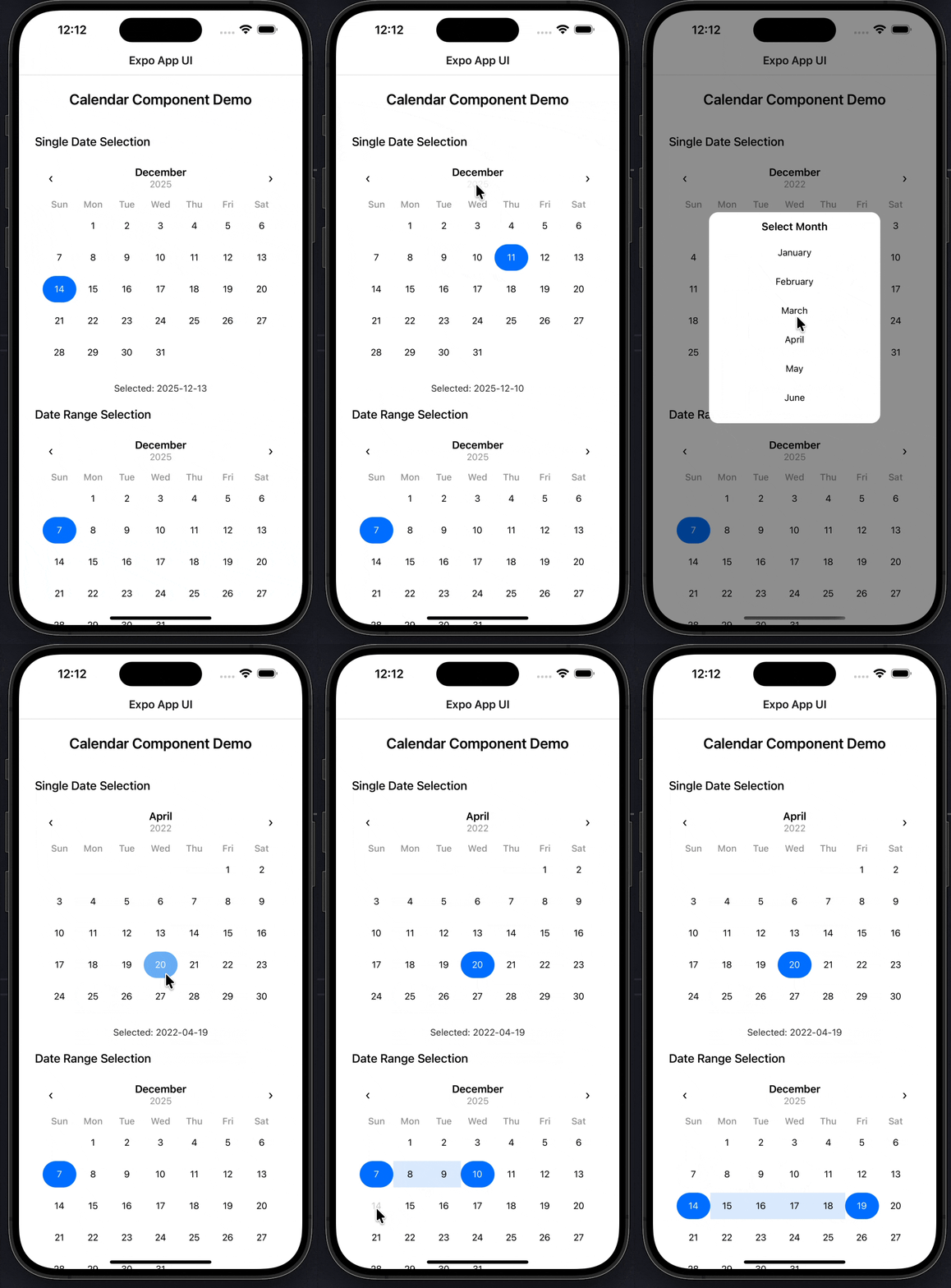
Calendar
A flexible calendar component supporting single date selection, date ranges, and customizable theming for Expo React Native. Learn how to use Calendar with examples and API documentation.
Installation
npx expo-app-ui add calendar:::note The calendar component is self-contained and doesn't require any external dependencies. :::
Usage
import Calendar from "@/components/ui/calender";

<Calendar
  mode="single"
  value={date}
  onChange={setDate}
/>
Complete Example
Here's a complete example showing all calendar features:
import Calendar from "@/components/ui/calender";
import React, { useState } from "react";
import { StyleSheet, Text, View } from "react-native";

export default function CalendarExampleScreen() {
  /* ---------- Single Date ---------- */
  const [singleDate, setSingleDate] = useState<Date | null>(null);

  /* ---------- Date Range ---------- */
  const [range, setRange] = useState<{
    start: Date | null;
    end: Date | null;
  }>({ start: null, end: null });

  return (
    <View style={styles.container}>
      <Text style={styles.heading}>Calendar Component Demo</Text>

      {/* ================= Single Select ================= */}
      <Text style={styles.subHeading}>Single Date Selection</Text>

      <Calendar
        mode="single"
        value={singleDate ?? new Date()}
        minDate="1900-01-01"
        maxDate={new Date().toISOString().split("T")[0]}
        onChange={setSingleDate}
        allowFutureDates={true}
      />

      {singleDate && (
        <Text style={styles.result}>
          Selected: {singleDate.toISOString().split("T")[0]}
        </Text>
      )}

      {/* ================= Range Select ================= */}
      <Text style={styles.subHeading}>Date Range Selection</Text>

      <Calendar
        mode="range"
        rangeValue={range}
        onRangeChange={setRange}
        minDate="1900-01-01"
        maxDate={new Date().toISOString().split("T")[0]}
      />

      {range.start && (
        <Text style={styles.result}>
          Start: {range.start.toISOString().split("T")[0]}
        </Text>
      )}

      {range.end && (
        <Text style={styles.result}>
          End: {range.end.toISOString().split("T")[0]}
        </Text>
      )}
    </View>
  );
}

const styles = StyleSheet.create({
  container: {
    flex: 1,
    padding: 24,
    backgroundColor: "#FFFFFF",
  },
  heading: {
    fontSize: 22,
    fontWeight: "600",
    textAlign: "center",
    marginBottom: 20,
  },
  subHeading: {
    fontSize: 18,
    fontWeight: "500",
    marginTop: 20,
    marginBottom: 12,
  },
  result: {
    marginTop: 10,
    textAlign: "center",
    fontSize: 14,
    color: "#333",
  },
});
Props
| Prop | Type | Default | Description |
|---|---|---|---|
mode | 'single' | 'range' | 'single' | Selection mode |
value | Date | - | Selected date (for single mode) |
onChange | (date: Date) => void | - | Callback when date changes (for single mode) |
rangeValue | DateRange | { start: null, end: null } | Selected date range (for range mode) |
onRangeChange | (range: DateRange) => void | - | Callback when range changes (for range mode) |
minDate | string | - | Minimum selectable date (YYYY-MM-DD format) |
maxDate | string | - | Maximum selectable date (YYYY-MM-DD format) |
allowFutureDates | boolean | false | Allow selection of future dates |
theme | CalendarTheme | {} | Custom theme object for styling |
DateRange Type
interface DateRange {
  start: Date | null;
  end: Date | null;
}
CalendarTheme Type
interface CalendarTheme {
  primaryColor?: string;
  rangeColor?: string;
  backgroundColor?: string;
  textColor?: string;
  mutedTextColor?: string;
  disabledTextColor?: string;
  selectedTextColor?: string;
  pickerBackground?: string;
  borderRadius?: number;
  daySize?: number;
}
Examples
Single Date Selection
const [date, setDate] = useState<Date | null>(null);

<Calendar
  mode="single"
  value={date ?? new Date()}
  onChange={setDate}
/>
Date Range Selection
const [range, setRange] = useState<DateRange>({
  start: null,
  end: null
});

<Calendar
  mode="range"
  rangeValue={range}
  onRangeChange={setRange}
/>
With Date Limits
<Calendar
  mode="single"
  value={date}
  onChange={setDate}
  minDate="1900-01-01"
  maxDate={new Date().toISOString().split("T")[0]}
  allowFutureDates={false}
/>
Custom Theme
<Calendar
  mode="single"
  value={date}
  onChange={setDate}
  theme={{
    primaryColor: "#2563EB",
    rangeColor: "#2563EB20",
    backgroundColor: "#FFFFFF",
    textColor: "#111827",
    mutedTextColor: "#6B7280",
    borderRadius: 12,
    daySize: 44,
  }}
/>
Range with Highlighting
<Calendar
  mode="range"
  rangeValue={range}
  onRangeChange={setRange}
  theme={{
    primaryColor: "#7C3AED",
    rangeColor: "#7C3AED30",
  }}
/>
Features
- Two Selection Modes: Single date or date range selection
- Month/Year Pickers: Quick navigation via modal pickers
- Date Range Highlighting: Visual indication of selected range
- Date Constraints: Min/max date and future date restrictions
- Customizable Theming: Full control over colors and styling
- Smooth Navigation: Previous/next month navigation
- Disabled Dates: Visual indication of non-selectable dates
- No Dependencies: Self-contained component
- TypeScript Support: Full TypeScript types included
Date Format
All date strings should be in YYYY-MM-DD format:
minDate="1900-01-01"
maxDate="2024-12-31"
Range Selection Behavior
- First Click: Sets the start date
- Second Click:
- If after start date: Sets end date
- If before start date: Resets and sets new start date
- Range Highlighting: Days between start and end are highlighted
Notes
- The calendar automatically handles month boundaries
- Disabled dates are visually distinct and non-interactive
- When
allowFutureDatesis false, dates after today are disabled - Month and year pickers open in modal overlays
- The calendar syncs with external
valuechanges in single mode - Range mode requires both
rangeValueandonRangeChangeprops - Theme values are merged with defaults
- The component uses a 6-row grid to display all days
- Days from previous/next month are shown as empty cells
- Selected dates are highlighted with the primary color
- Range dates are highlighted with a semi-transparent background